Section 3 Case 1
We provide the step-by-step instructions on how to identify modular/community structure (Step 2), the essential to subsequently interpret the genetic interaction network, both visually intuitive and scientifically sound. Steps 3-6 detail how to determine 2D coordinates of the network respecting modular structure, and how to add the hull and labelling for each of the modules, while Steps 7-12 show how to perform pathway analysis of modules for knowledge discovery and interpretation.
Step 1: Load the packages and import human genetic interaction data (see Materials).
# load packages used in this case
library(tidyverse)
library(igraph)
library(dnet)
library(XGR)
library(ggrepel)

# also load the package "osfr" aided in importing data from https://osf.io/gskpn
library(osfr)
guid <- "gskpn"

# import the genetic interaction network data
ig.BioGRID_genetic <- xRDataLoader("ig.BioGRID_genetic", guid=guid)

# keep the largest interconnected component
# return an igraph object called "ig"
ig.BioGRID_genetic %>% dNetInduce(nodes_query=V(ig.BioGRID_genetic)$name) -> ig
Step 2: Identify modular structure using the multi-level modularity optimisation algorithm.
# the object "ig" appended with a node attribute "modules"
ig %>% cluster_louvain() %>% membership() -> V(ig)$modules
Step 3: Determine 2D coordinates for nodes, initialised within a module (using the
Kamada-Kawai layoutalgorithm) and then adjusted considering between-module relations (via thediffusion-limited aggregationalgorithm).
# the object "ig" appended with two node attributes "xcoord" and "ycoord"
# and an edge attribute "color"
ig %>% xAddCoords("modules") -> ig
Step 4: Visualise the network respecting modular structure.
# nodes placed by coordinates
# nodes colored by modules using the color scheme "ggplot2"
# edges colored differently within a module and between modules
# colorbar hidden
# return a ggplot object "gg"
ig %>% xGGnetwork(node.xcoord="xcoord", node.ycoord="ycoord", node.color="modules", colormap="ggplot2", node.color.alpha=0.5, node.size.range=0.3, edge.color="color", edge.arrow.gap=0) + guides(color="none") -> gg

# make node colors discrete with colorbar hidden
breaks <- seq(1, n_distinct(V(ig)$modules))
gg + scale_colour_gradientn(colors=xColormap("ggplot2")(64), breaks=breaks) -> gg
Step 5. Compute the hull for nodes per module that is added as a polygon layer.
# data for nodes extracted from the object "gg"
# data nested by the column "modules"
# apply the function "chull" to the nested data per module
# results unnested to obtain the coordinates for hull points per module
# edges colored differently within a module and between modules
# return a tibble "df_hull"
gg$data_nodes %>% nest(data=-modules) %>%
mutate(res=map(data,~slice(.x, chull(.x$x,.x$y)))) %>%
unnest(res) %>% select(modules, x, y) -> df_hull

# the object "gg" added with a polygon layer
# hull colored using the color scheme "ggplot2" with the colorbar hidden
gg + geom_polygon(data=df_hull,aes(x, y, group=modules, fill=modules),alpha=0.1) +
scale_fill_gradientn(colors=xColormap("ggplot2")(64), breaks=breaks) + guides(fill="none") -> gg
Step 6. Label modules as a text layer, altogether shown in FIGURE 3.1.
# calculate the centre point coordinates for each of hulls/modules
# done so by first grouping by modules
# then being summarised into the median point of nodes for each of hulls
# return a tibble "df_centre"
df_hull %>% group_by(modules) %>% summarise(x0=median(x), y0=median(y))-> df_centre

# the object "gg" added with a text layer
gg + geom_text_repel(data=df_centre, aes(x0, y0, label=modules)) -> gg

# shown collectively by simply typing the object "gg"
gg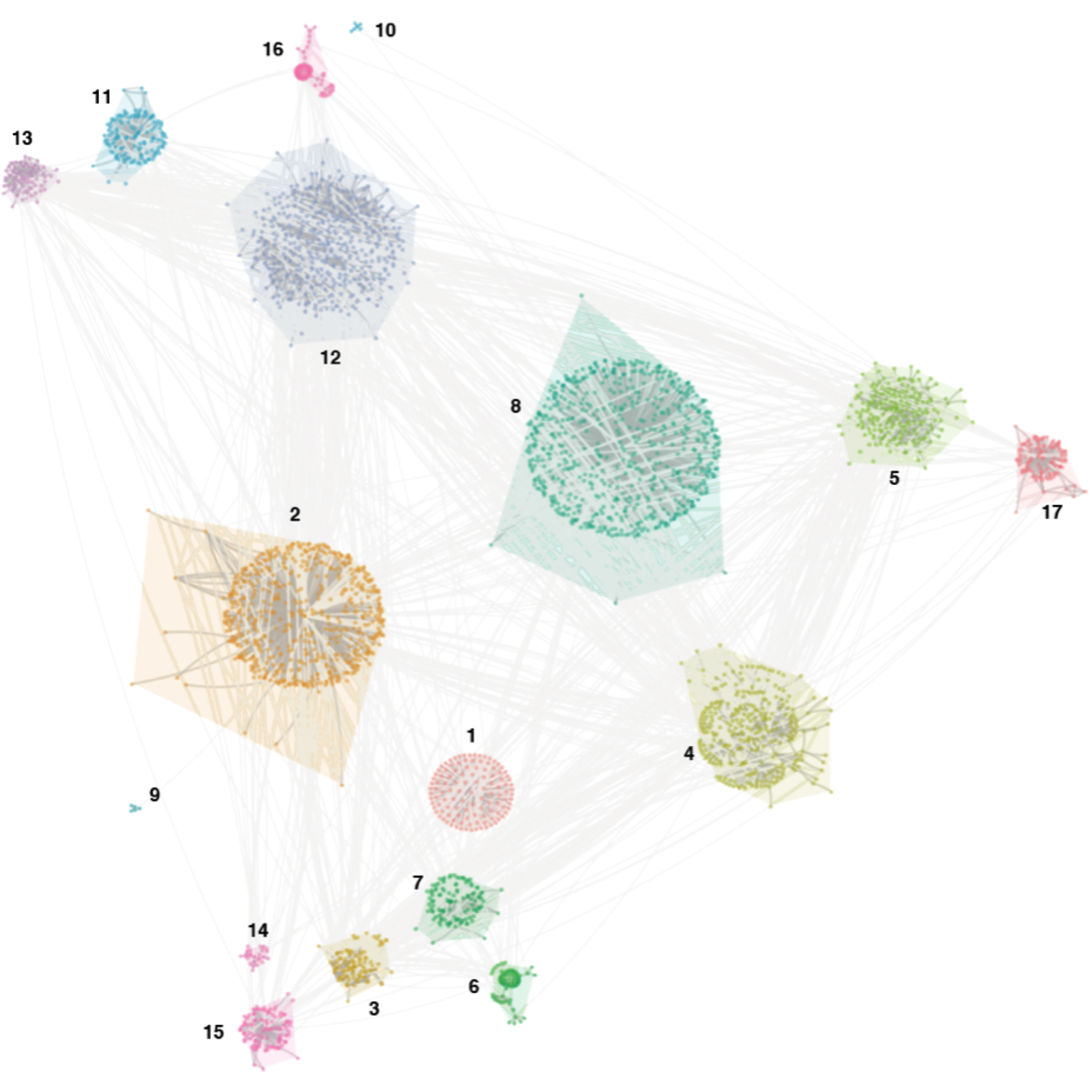
FIGURE 3.1: Network visualisation of human genetic interactions respecting the modular structure.
Step 7. Summarise the number of genes found in each module (FIGURE 3.2).
# extract the number of genes per module
ig %>% igraph::as_data_frame("vertices") %>% count(modules) -> data

# modules sorted by gene numbers, converted into a factor type
data %>% arrange(desc(n)) %>% mutate(modules=modules %>% as.character() %>% fct_inorder()) -> data

# draw the bar plot
data %>% ggplot(aes(modules,n)) + geom_bar(stat="identity", fill="steelblue") + scale_y_log10(limits=c(1,1000)) + coord_flip() + theme_minimal()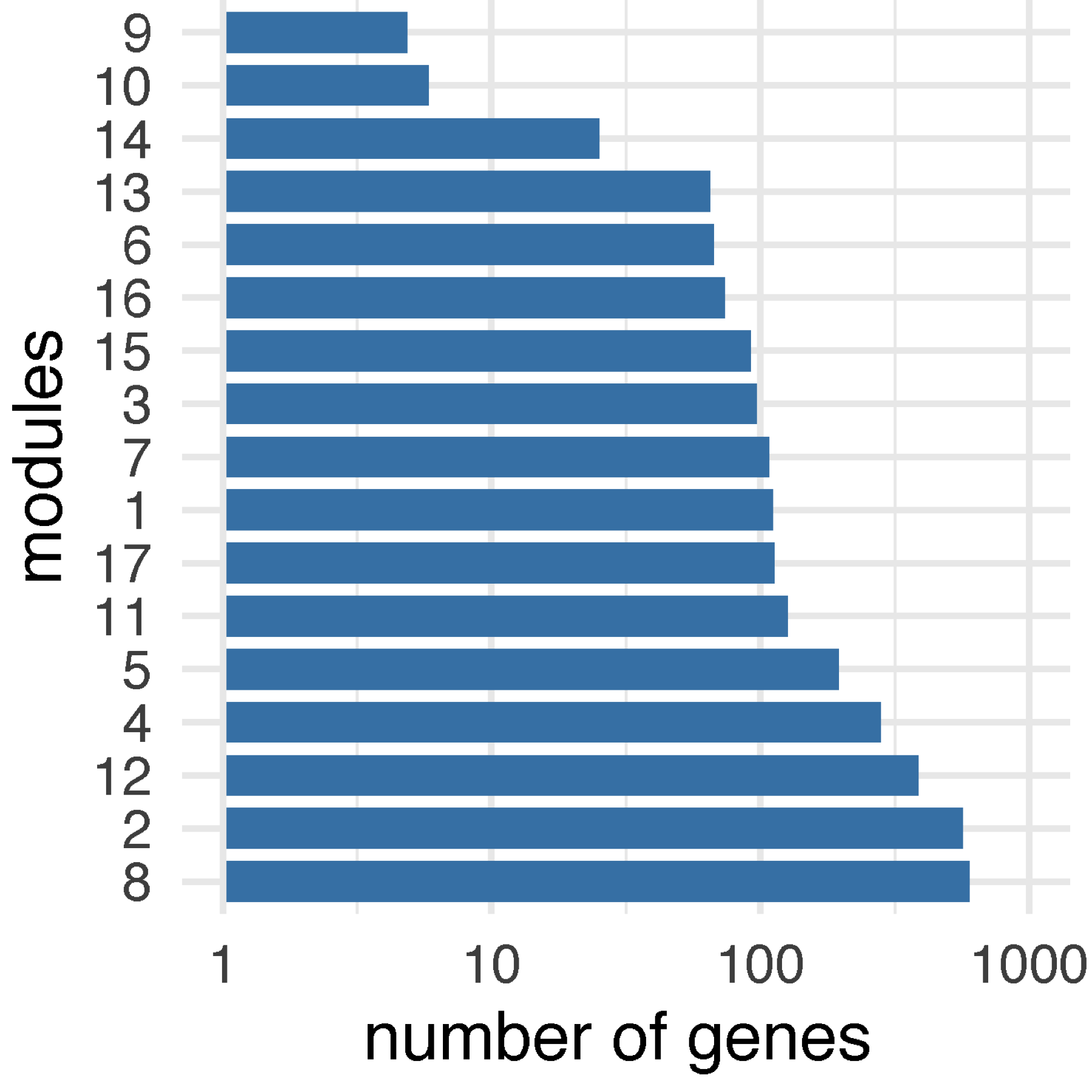
FIGURE 3.2: Bar plot of the number of genes across modules.
Step 8. Perform pathway enrichment analysis for genes in each module.
# extract genes per module
ig %>% igraph::as_data_frame("vertices") %>% select(symbol, modules) %>% arrange(modules) -> df

# define the test background
df %>% pull(symbol) -> background

# perform enrichment analysis using KEGG environmental process pathways
# Fisher's exact test used by default
# return a tibble "df_nested" with the list-column "eTerm" for enrichment results
# each contains an eTerm object if found, NULL otherwise
df %>% nest(data=-modules) %>% mutate(eTerm=map(data, ~xEnricherGenes(.x$symbol, background=background, ontology="KEGGenvironmental", guid=guid))) -> df_nested

# the tibble "df_nested" with rows/modules filtered out if NULL
df_nested %>% filter(map_lgl(eTerm, ~!is.null(.x))) -> df_nested

# the tibble "df_nested" appended with two list-columns
# the list-column "forest" for forest plot and "ladder" for ladder plot
# both plots as a ggplot object
df_nested %>%
mutate(forest=map(eTerm, ~xEnrichForest(.x))) %>%
mutate(ladder=map(eTerm, ~xEnrichLadder(.x))) -> df_nested

# print the content of the tibble "df_nested"
df_nested
Step 9. Explore enrichment results for a module (FIGURE 3.3).
# print the content of the eTerm object for module 3
# note: the 2nd row of the tibble "df_nested"
df_nested$eTerm[[2]]

# visualise as a forest plot for module 3
df_nested$forest[[2]]

# visualise as a dot plot for module 3
df_nested$ladder[[2]]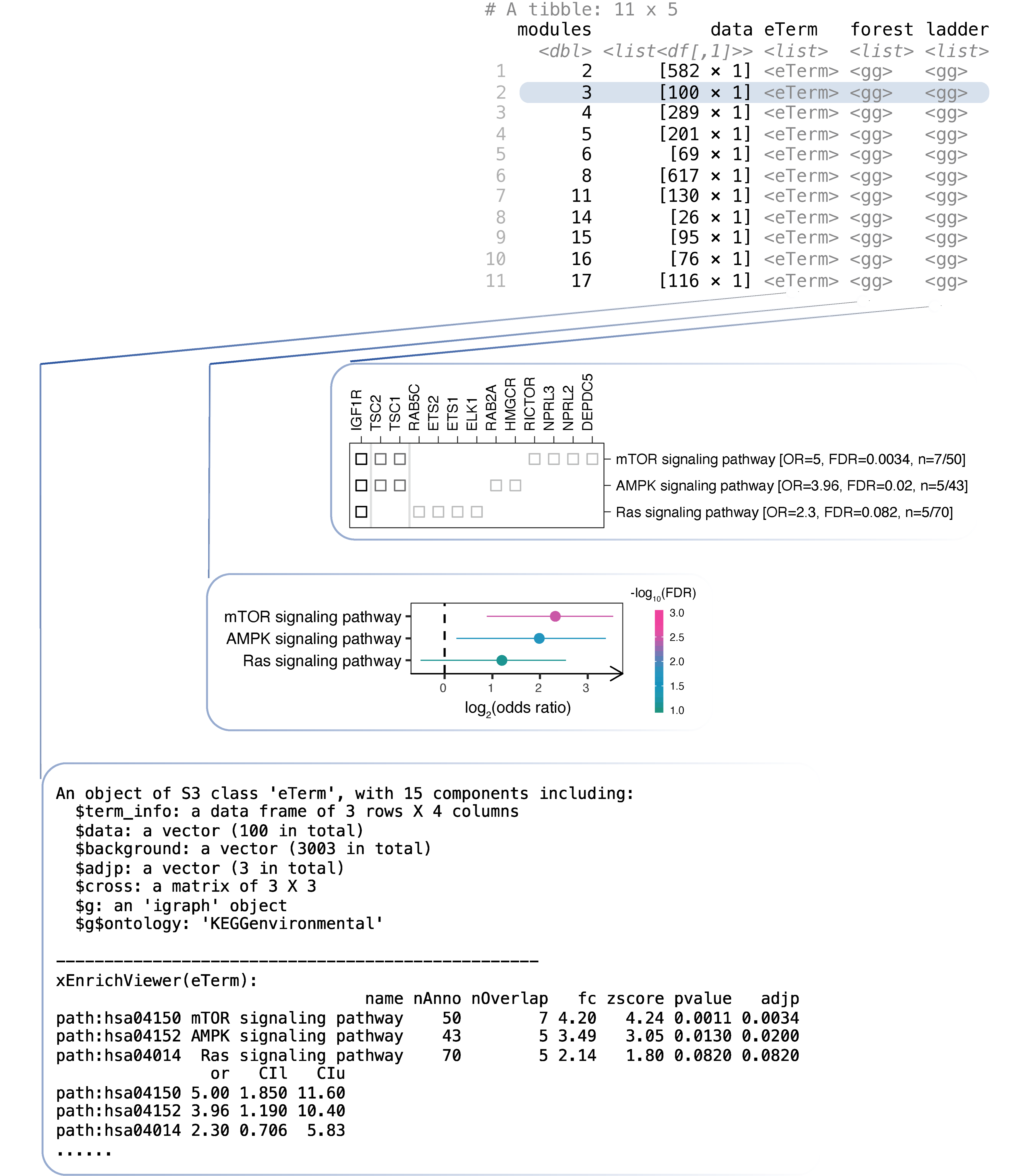
FIGURE 3.3: Pathway analysis of network modules. Top: a tibble designed to capture module-centric information, including input data and the results sequentially generated along the analysis. The results for module 3 are illustrated including the eTerm object, the forest plot, and the ladder plot
Step 10. Prepare the output for all modules.
# the tibble "df_nested" appended with the list-column "output"
# each entry in this list-column is a conventional data frame
df_nested %>% mutate(output=map(eTerm, ~xEnrichViewer(.x, "all"))) -> df_nested

# print the content of the updated tibble "df_nested"
df_nested

# the tibble "df_nested" unnested into a tibble "df_output"
df_nested %>% select(modules, output) %>% unnest(output) -> df_output

# print the content of the tibble "df_output"
df_output
Step 11. Output enrichment results into a file
output.txt.
# write into a text file "output.txt" in the R working directory
df_output %>% write_delim("output.txt", delim="\t")
Step 12. Visualise and compare enrichment results between modules (FIGURE 3.4 and FIGURE 3.5).
# rename the column "modules" into "group" in the tibble "df_output"
df_output %>% rename(group=modules) %>% as.data.frame() -> df_output

# forest plot of up to top 5 pathways enriched (FDR<0.05 and CI>1) per module
# return a ggplot object "gg_forest"
df_output %>% xEnrichForest(top_num=5, CI.one=F, drop=T, zlim=c(0,20)) -> gg_forest
gg_forest

# chord plot of pathways (the left-half) enriched in modules (right-half)
# up to top 5 pathways (FDR<0.05) per module shown
# note: the gap/angle between two halves controlled by the argument "big.gap"
df_output %>% xEnrichChord(top_num=5, legend=F, text.size=0.4, big.gap=90)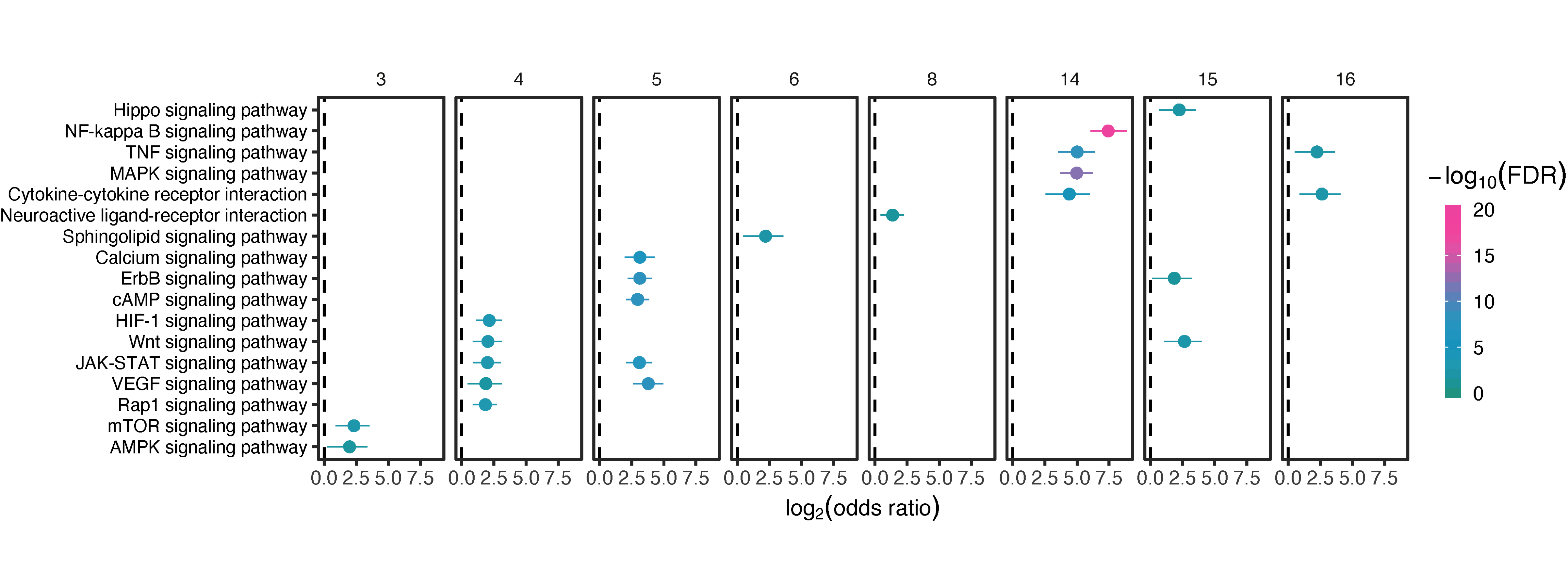
FIGURE 3.4: Forest plot of up to 5 the most enriched pathways (FDR<0.05) per module.
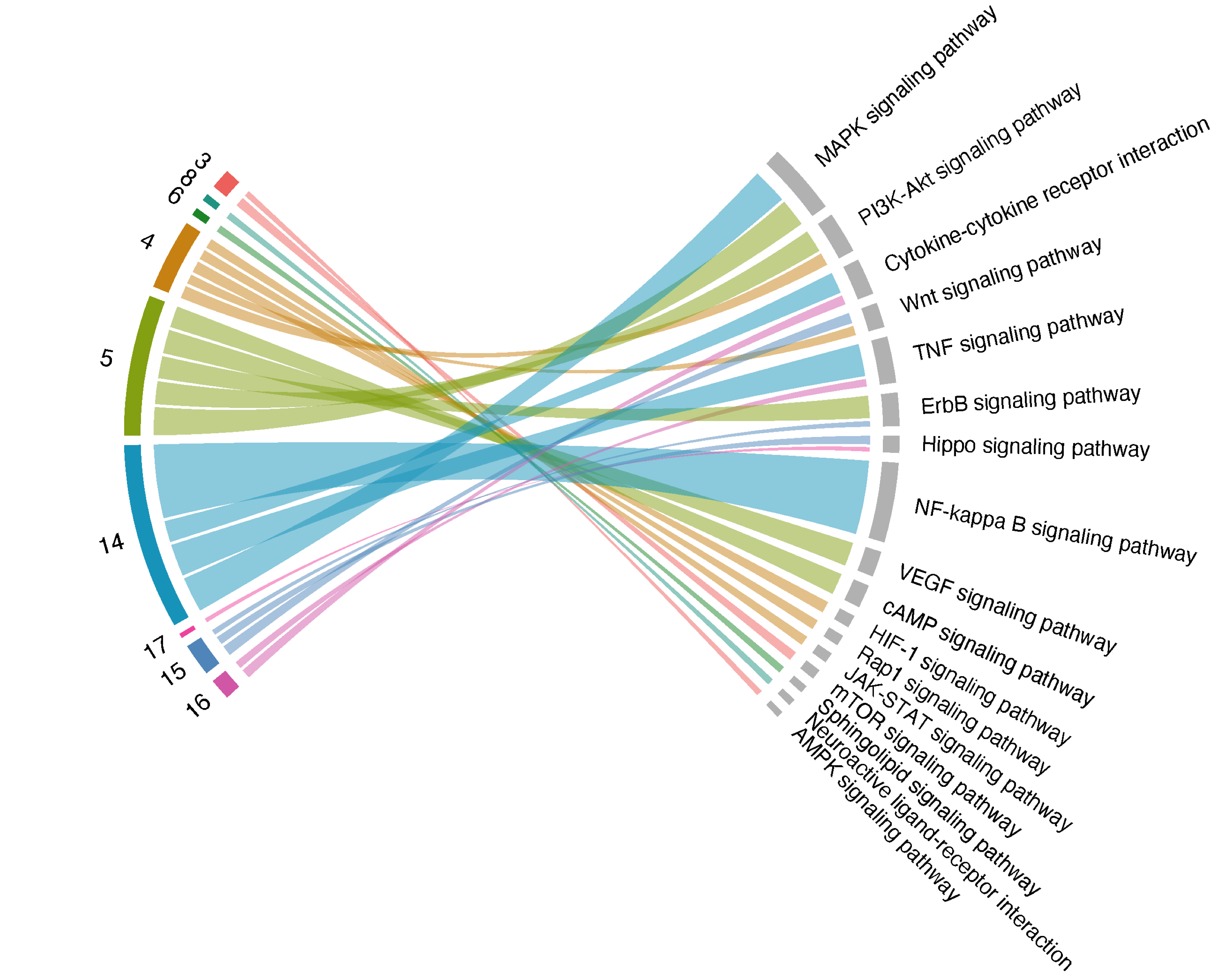
FIGURE 3.5: Chord plot of up to 5 the most enriched pathways (FDR<0.05; the left-half part) per module (right-half part), with link thickness proportional to the enrichment Z-scores.