Section 5 Case 3
In this case, we introduce a more advanced analysis workflow (FIGURE 5.1), showing how to identify tissue clusters (Steps 2 and 7) and differential interactions (Steps 8-10) based on the integration of genetic interactions with gene expression.
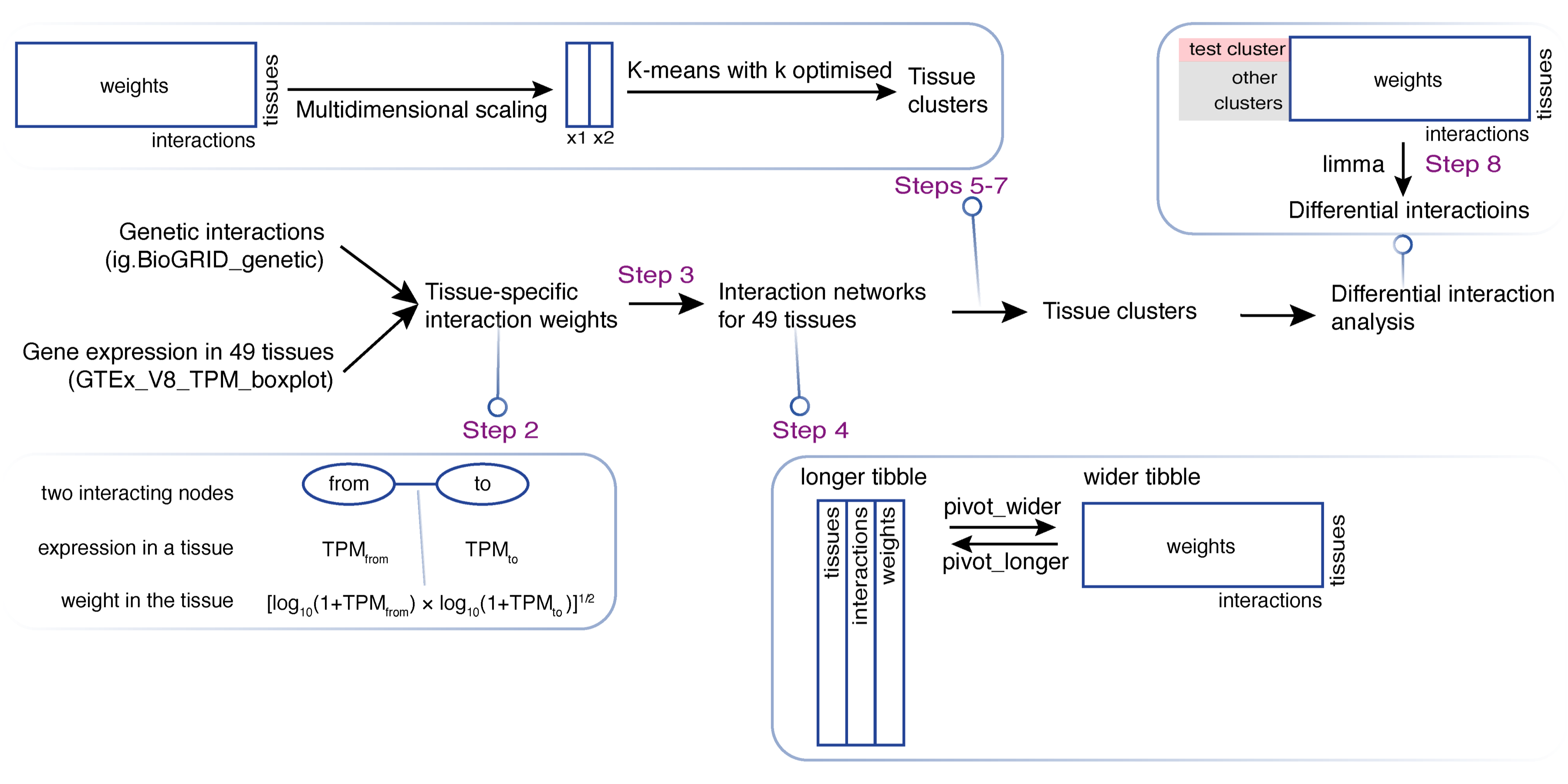
FIGURE 5.1: Schematic illustration of tissue clustering and differential analysis in lights of genetic interactions. Key steps labelled that are detailed below.
Step 1: Load the packages and import human genetic interaction data as well as human tissue gene expression data (see Materials).
# load the packages used in this case
library(tidyverse)
library(igraph)
library(XGR)
library(ggrepel)
library(magrittr)
library(broom)
library(limma)
library(biobroom)
library(patchwork)
library(gridExtra)

# also load the package "osfr" aided in importing data from https://osf.io/gskpn
library(osfr)
guid <- "gskpn"

# import genetic interaction data
# converted into two tibbles "nodes" and "edges"
ig.BioGRID_genetic <- xRDataLoader("ig.BioGRID_genetic", guid=guid)
ig.BioGRID_genetic %>% igraph::as_data_frame("vertices") %>% as_tibble() -> nodes
ig.BioGRID_genetic %>% igraph::as_data_frame("edges") %>% as_tibble() -> edges

# import gene expression data
GTEx_V8_TPM_boxplot <- xRDataLoader("GTEx_V8_TPM_boxplot", guid=guid)
Step 2. Estimate tissue-specific interaction weights.
# nested by tissues
# calculate weight for each interaction and for each tissue
# return a tibble "df_nested" with a list-column "interactions"
GTEx_V8_TPM_boxplot %>% nest(data=-SMTSD) %>%
mutate(interactions=map(data, function(x){
    x %>% select(Symbol,middle) -> x
    edges %>% inner_join(x, by=c("from"="Symbol")) %>% rename(from_TPM=middle) %>%
    inner_join(x, by=c("to"="Symbol")) %>% rename(to_TPM=middle) %>%
    mutate(weight=sqrt(log10(from_TPM+1)*log10(1+to_TPM)))
})) -> df_nested
Step 3. Extract tissue-specific interactions.
# unnested by interactions
# add interaction name "name"
# return a tibble "df_interactions"
df_nested %>% select(SMTSD, interactions) %>% unnest(interactions) %>%
mutate(name=str_c(from,"<->",to)) -> df_interactions
Step 4. Prepare a tissue-interaction matrix.
# pivot data from long to wide
# return a data frame "mat"
# also used for differential interaction analysis at Step 8
mat <- df_interactions %>% select(SMTSD, name, weight) %>%
pivot_wider(names_from=SMTSD, values_from=weight) %>% column_to_rownames("name")
Step 5. Conduct the
multidimensional scalingon tissues.
# based on the pairwise distance between tissues, projected onto 2D space
t(mat) %>% dist() %>% cmdscale(2, eig=T) -> res

# extract tissue coordinates on 2D space
# return a tibble "coord_tissues" with 3 columns
# "SMTSD" for tissues, "x1" and "x2" for 2D coordinates
res$points %>% set_colnames(c("x1","x2")) %>% as_tibble(rownames="SMTSD") -> coord_tissues
Step 6. Optimise the number of tissue clusters using
K-means(FIGURE 5.2 and FIGURE 5.3).
# perform K-means clustering using a series of cluster numbers (k)
# summarise clustering output
# set seed to reproduce results
# return a tibble "kclusts"
set.seed(825)
coord_tissues %>% select(x1,x2) -> data
kclusts <- tibble(k=1:8) %>% mutate(res=map(k, ~kmeans(data,.x)),
    glanced=map(res, glance), augmented=map(res, ~augment(.x,data))
)

# the variance within the clusters decreases as k increases
# the bend/elbow point indicates no gain having more clusters
kclusts %>% unnest(glanced) %>% ggplot(aes(k, tot.withinss)) + geom_line()

# tissues colored by clusters for each value of k
# note: the same color only means tissues within the same cluster
kclusts %>% unnest(augmented) %>% mutate(k=str_c("k=",k)) %>% ggplot(aes(x1,x2)) + geom_point(aes(color=.cluster)) + facet_wrap(~k,ncol=4) + guides(color="none")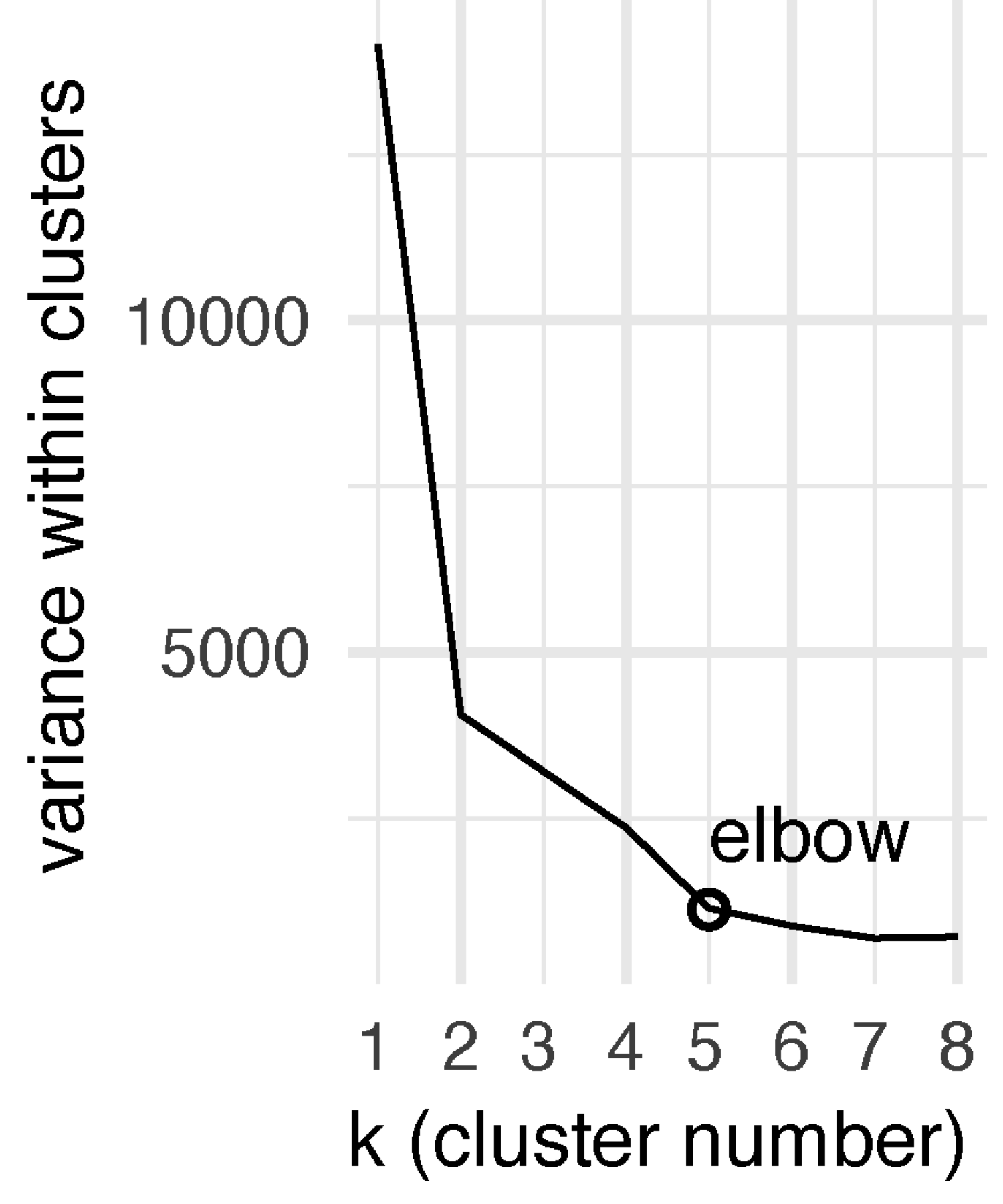
FIGURE 5.2: Line plot showing the total variance within clusters against the predefined cluster numbers (k). The elbow is seen at k=5, that is, the optimal cluster number minimising within-cluster variance.
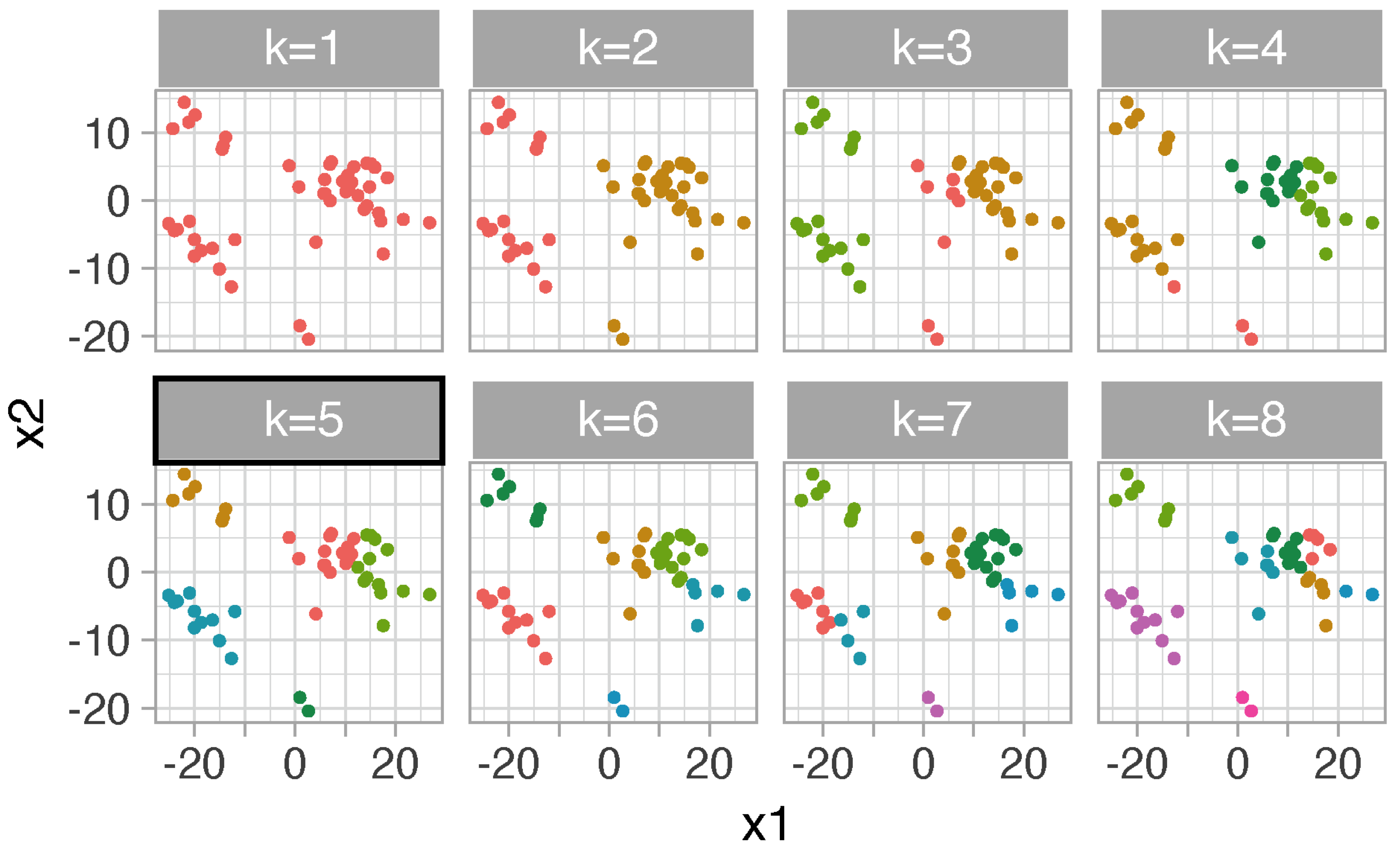
FIGURE 5.3: Dot plot of tissues color-coded by clusters. For example, at k=5, tissues are separated into five clusters and colored differently. Each tissue has 2D coordinates (x1 and x2) resulted from multidimensional scaling of interactions versus tissues matrix.
Step 7. Visualise the optimal tissue clusters (FIGURE 5.4).
# assign tissues to one of 5 clusters (optimal)
# return a tibble "assignments"
kclusts %>% unnest(augmented) %>% filter(k==5) %>%
left_join(coord_tissues, by=c("x1","x2")) -> assignments

# tissues shaped by clusters
# label brain-derived tissues: two clusters revealed
# cluster 4 (cerebellar tissues)
# cluster 5 (the rest brain tissues)
assignments %>% filter(str_detect(SMTSD, "Brain")) -> data
ggplot(assignments, aes(x1,x2,shape=.cluster)) + geom_point() +
geom_text_repel(data=data, aes(label=SMTSD), size=2) + theme_light()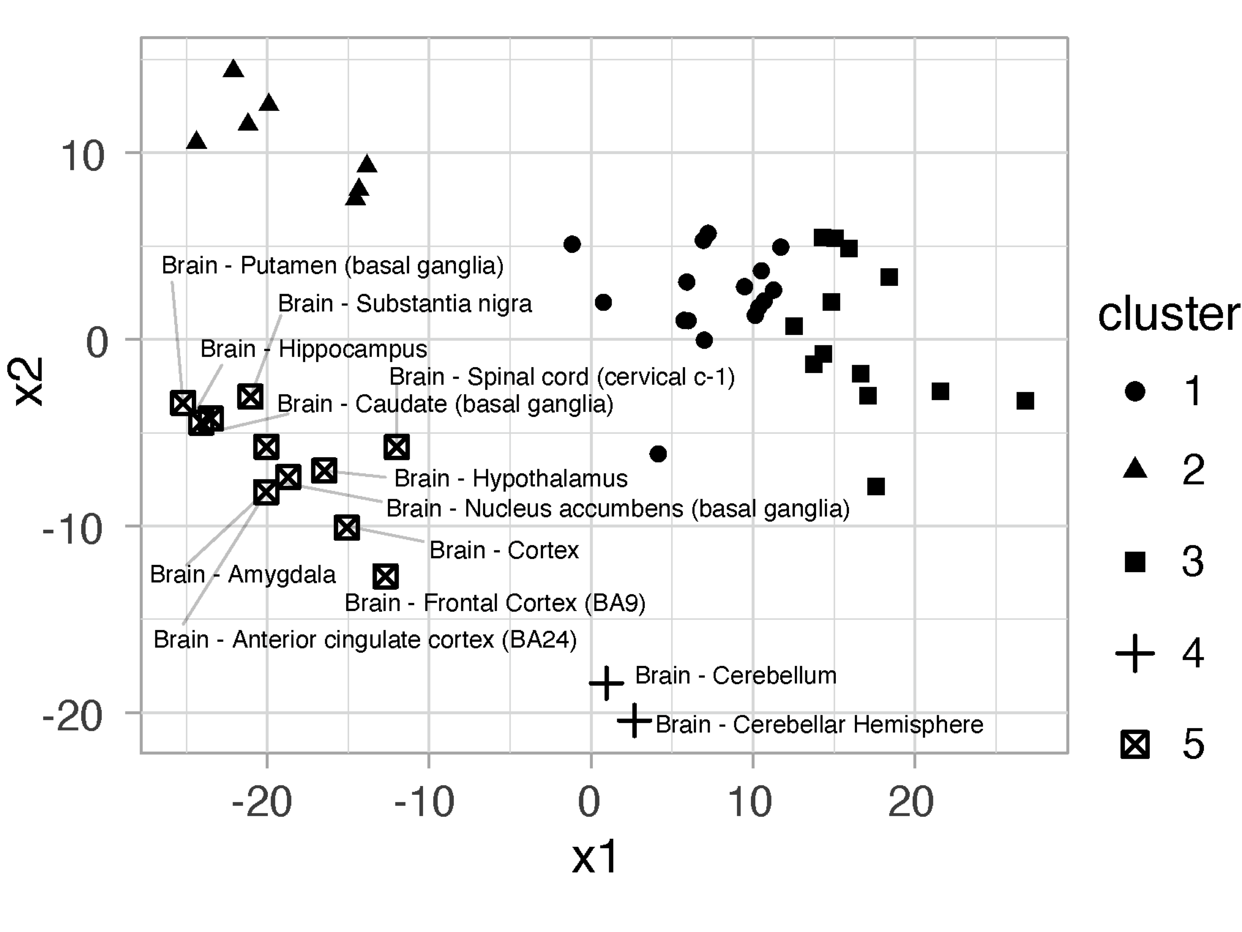
FIGURE 5.4: Dot plot of tissues at k=5, shaped by clusters. Brain-derived tissues are labelled to show that all brain tissues are clustered together (cluster 5) except two cerebellar tissues (cluster 4).
Step 8. Detect differential interactions between cluster 5 and other clusters.
# define the design matrix
# return a matrix "design"
assignments %>% mutate(group=ifelse(.cluster==5, "test", "other")) %>%
select(SMTSD,group) -> df_group
df_group %>% pull(group) %>% factor() %>% levels() -> lvls
model.matrix(~0+factor(group),df_group) %>% set_colnames(lvls) -> design

# fit linear model
fit <- lmFit(mat, design)

# construct contrast (cluster 5 tested against other clusters)
contrast.matrix <- makeContrasts(contrasts="test-other", levels=design)

# computer contrast from fitted linear model
fit2 <- contrasts.fit(fit, contrast.matrix)

# calculate empirical Bayes statistics for differential interactions
eb <- eBayes(fit2)

# tidy eBayes results, and calculate adjusted p-values
# return a tibble "df_results"
tidy(eb) %>% nest(data=-term) %>% mutate(adjp=map(data,~p.adjust(.x$p.value,method="BH"))) %>% unnest(c(data,adjp)) %>% arrange(adjp) -> df_results
Step 9. Draw volcano plot showing differential interactions (FIGURE 5.5).
# coefficient estimate [log2(fold change)] vs adjusted p-values
# colored by empirical Bayes t-statistic, using the color scheme "jet.both"
# return a ggplot object "gg"
df_results %>% ggplot(aes(x=estimate, y=-log10(adjp), color=statistic)) +
geom_point() + scale_colour_gradientn(colors=xColormap("jet.both")(64)) + theme_minimal() + guides(color="none") -> gg

# label the top 10 interactions abundant in cluster 5
df_results %>% filter(estimate>0) %>% top_n(10, -adjp) -> data
gg + geom_text_repel(data=data, aes(label=gene), color="black", size=2) 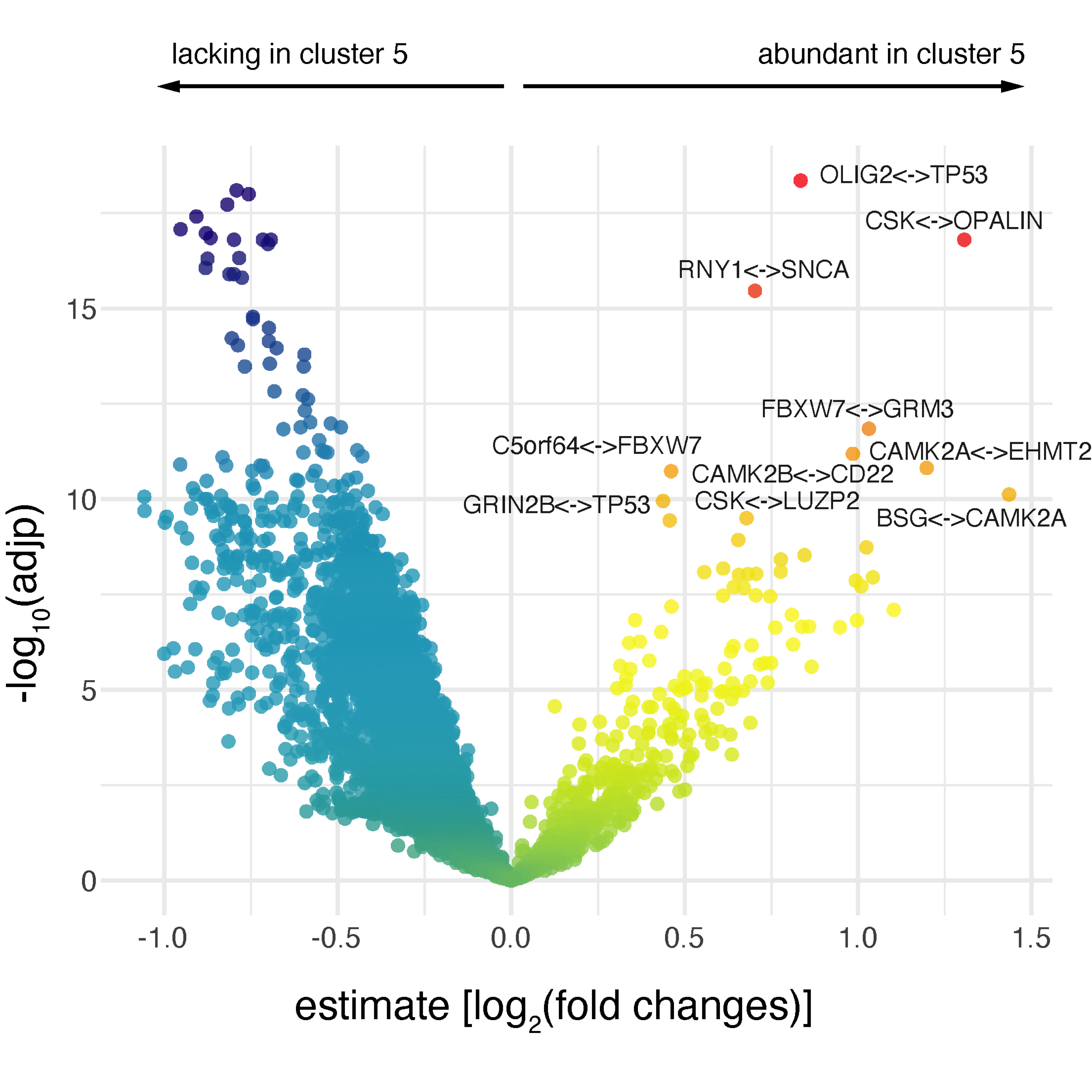
FIGURE 5.5: Volcano plot showing differential interactions. Colored by empirical Bayes t-statistic, labelled for the top 10 interactions abundant in cluster 5.
Step 10. Construct and visualise a network of abundant interactions in cluster 5 (FIGURE 5.6).
# extract edges with adjp < 0.01
df_results %>% filter(estimate>0, adjp<0.01) %>%
separate(gene,c("from","to"),sep="<->") %>%
select(from,to,estimate) %>% as.data.frame -> edges_ab

# extract nodes with adjp < 0.01
df_results %>% filter(estimate>0, adjp<0.01) %>%
separate_rows(gene, sep="<->") %>% distinct(gene) %>% rename(name=gene) %>%
inner_join(nodes, by="name") %>% as.data.frame() -> nodes_ab

# construct the network
# return an igraph object "ig_ab"
ig_ab <- igraph::graph_from_data_frame(d=edges_ab, directed=F, vertices=nodes_ab)

# the object "ig_ab" appended with two node attributes "xcoord" and "ycoord"
# coordinates calculated using the Fruchterman-Reingold layout algorithm
ig_ab %>% xLayout("gplot.layout.fruchtermanreingold") -> ig_ab

# the object "ig_ab" appended with a node attribute "degree" (the node degree)
igraph::degree(ig_ab) -> V(ig_ab)$degree

# the object "ig_ab" appended with a node attribute "label"
# in order to label nodes with 2 or more neighbors
ifelse(V(ig_ab)$degree>=2, V(ig_ab)$name, "") -> V(ig_ab)$label

# visualise the network
# label nodes with 2 or more neighbors
# nodes placed by coordinates on the plane
# nodes sized by degree
# return a ggplot object "gg_ab"
ig_ab %>% xGGnetwork(node.label="label", node.label.size=1.5, node.xcoord="xcoord", node.ycoord="ycoord", node.size="degree", node.size.range=c(0.5,4), edge.color="lightblue", edge.arrow.gap=0) + guides(size="none") -> gg_ab
gg_ab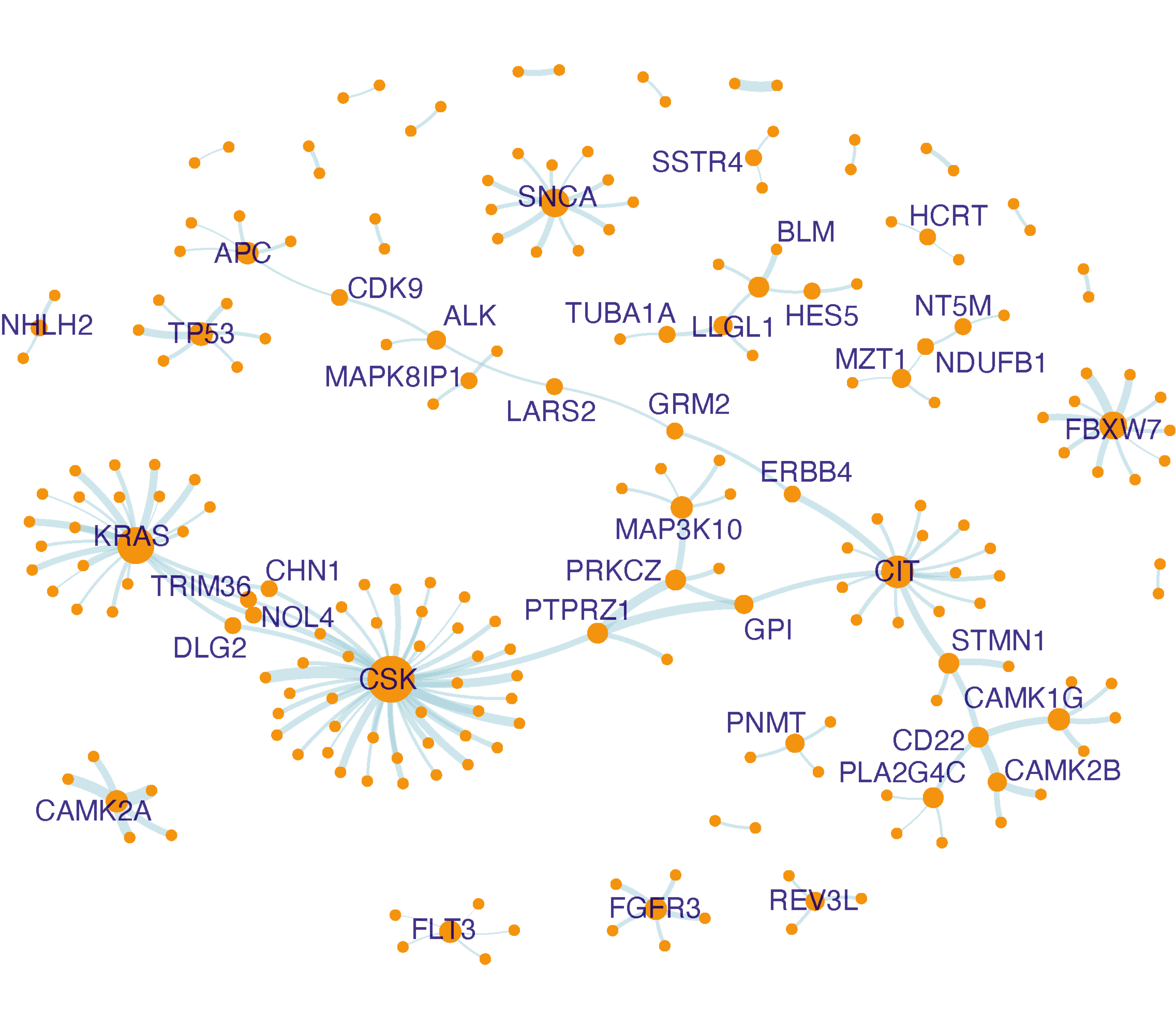
FIGURE 5.6: Network visualisation of interactions abundant in cluster 5. Nodes sized by degree (i.e. the number of neighbors), and if having two or more neighbors, also labelled.
Step 11. Perform KEGG pathway enrichment analysis for genes involved in abundant interactions in cluster 5 (FIGURE 5.7).
# define the test background (all interacting genes)
df_results %>% separate_rows(gene, sep="<->") %>%
distinct(gene) %>% pull(gene) -> background

# perform enrichment analysis using KEGG pathways
# return an eTerm object "eTerm_kegg"
V(ig_ab)$name %>% xEnricherGenes(background=background, ontology="KEGG", guid=guid) -> eTerm_kegg

# visualise enriched pathways faceted by category
# label up to top 3 per category
eTerm_kegg %>% xEnrichViewer("all", detail=T) %>% rename(group=namespace) %>% filter(group %in% c("Cellular Process","Environmental Process","Human Diseases","Organismal Systems")) %>% xEnrichDotplot(label.top=3) + facet_wrap(~group, ncol=4)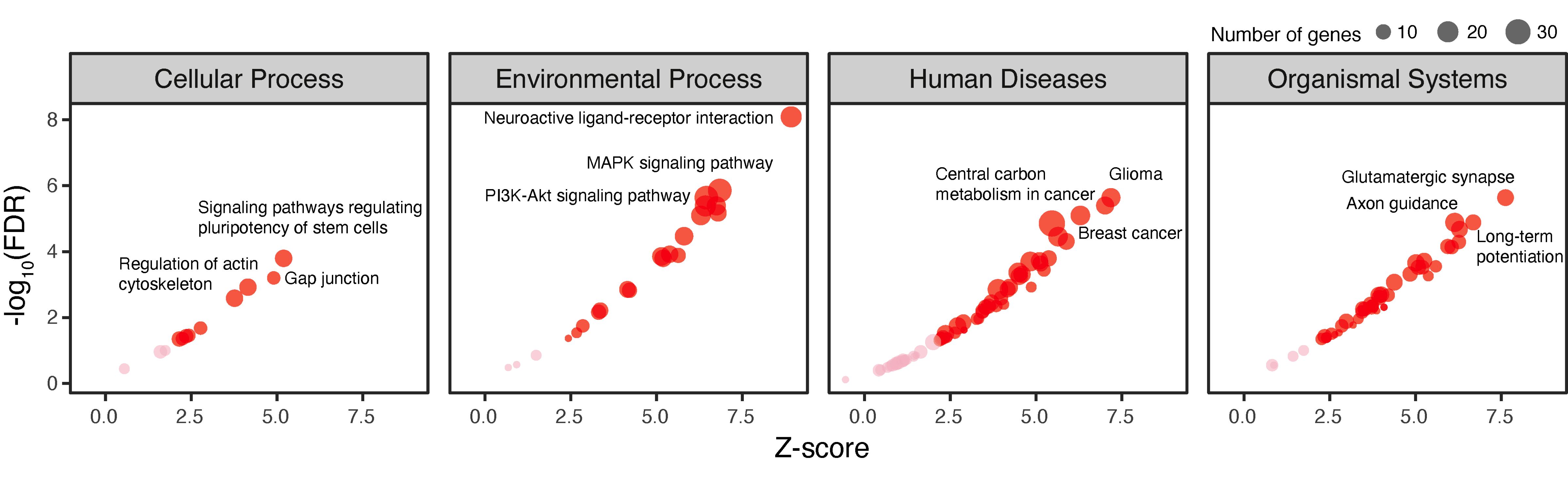
FIGURE 5.7: Pathway analysis of genes involved in interactions abundant in cluster 5. Based on KEGG pathways grouped into four categories. The dot plot is shown separately for each category, with the top 3 enriched pathways labelled for each category using one-sided Fisher’s exact test.
Step 12. Conduct evolutionary analysis for genes involved in abundant interactions in cluster 5 (FIGURE 5.8).
# define the test background (all interacting genes)
df_results %>% separate_rows(gene,sep="<->") %>%
distinct(gene) %>% pull(gene) -> background

# perform evolutionary analysis using phylostratigraphy
# based on two-sided Fisher's exact test
# return an eTerm object "eTerm_psg"
V(ig_ab)$name %>% xEnricherGenes(background=background, ontology="PSG", size.range=c(10,20000), p.tail="two-tails", guid=guid) -> eTerm_psg

# forest plot for all ancestors analysed
# return an ggplot object "gg_psg"
xEnrichForest(eTerm_psg, top_num="auto", FDR.cutoff=1, sortBy="none") -> gg_psg

# a table listing genes first created at the ancestors (enriched only)
# return a gtable object "gt_psg"
eTerm_psg %>% xEnrichViewer("all", details=T) %>% as_tibble(rownames="id") %>%
mutate(id=as.numeric(id)) %>% arrange(id) %>% column_to_rownames("id") %>%
filter(zscore>0, adjp<0.05) %>%
mutate(Ancestor=name, Genes=str_wrap(members_Overlap,width=50)) %>%
select(Ancestor,Genes) %>% tableGrob(rows=NULL,theme=ttheme_default(base_size=6)) -> gt_psg

# visualise together the forest plot and the table together
# using the package "patchwork", a composer of plots
gg_psg + gt_psg + plot_layout(ncol=2, widths=c(1,3))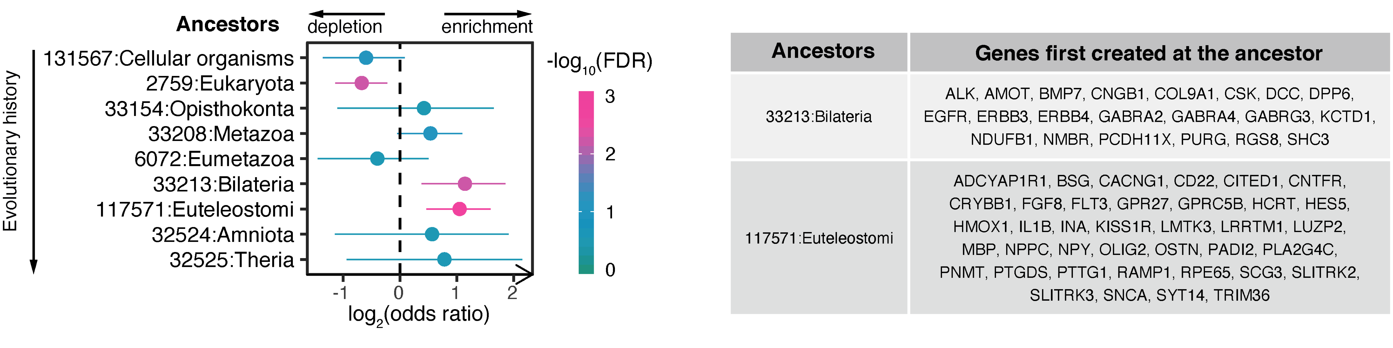
FIGURE 5.8: Evolutionary analysis for genes involved in abundant interactions in cluster 5. Left, the forest plot showing phylostrata (ancestors; ordered by evolutionary history) enriched and depleted based on two-sided Fisher’s exact test. Right, a table listing genes first created at the ancestors (enriched).